A good interface shouldn't be noticed by the user. There should be consistency in the design of whatever websites or applications in order to offer the user a feeling of control. In the sense that being “good” is to be accessible, open and convenient, this definition is correct, but I feel like it is limited.
“Good” is subjective in regard to one’s worldview. If you enjoy inaccessibility, guardedness and being an inconvenience, then that is what is "good" to you. I disagree with you, but I doubt I can change your opinion, considering your stubbornness. The one thing we can agree on, however, is that occasionally gatekeeping has value.
Take a discussion on an obscure topic, for example. The best possible discussion that could take place surrounding this subject is one that solely includes people educated on the issue at hand, thus providing meaningful discourse and argumentation. If you drop someone into this discussion who has no idea what’s going on but give them the same facilities as every other participant to contribute, they might say just as much as everyone else, but they definitely won’t say anything as pertinent.
I'd like to apply this same principle to user interfaces. In terms of web design, it could be argued that gatekeeping could be productive. Hobbies one pursues on the internet shouldn't necessarily be vetted for those deemed “worthy." However, there are steps that could be taken to make users reach a point where not only their experience on the website is more worthwhile and enjoyable, for everyone — including the user themselves.
For me, Goodreads is a perfect example of this type of combative user interface that actually serves a purpose. As a catalog that allows individuals to search its database of books, annotations, quotes and reviews, Goodreads has received lots of criticism for its seemingly outdated interface which is hard to navigate and also prone to bugs. However, there are steps that could be taken to reach a point where everyone's experience on the website is more worthwhile and enjoyable, including the user themselves.
If you look at Goodreads’ most-rated book, "Harry Potter and the Sorcerer's Stone", popular reviews presently include detailed analyses, personal anecdotes and moving expressions of love for the story. On the contrary, Letterboxd, a film-centric social networking site with a much more traditionally accessible UI than Goodreads, has significantly duller discussion. Looking at "Parasite", the most-watched movie on the app, you can see that most of the film’s popular reviews are just jokes. Sure, some are pretty funny, but personally, some of them make me want to gouge my eyes out.
I suppose it all works on a case-by-case basis, but that exact attention to what makes specific applications or websites the best versions of themselves should be detailed and related to the subject at hand. Reading as a pursuit consumes weeks of people's time just to finish one story. Surely discussion regarding books should be just as rigorous.
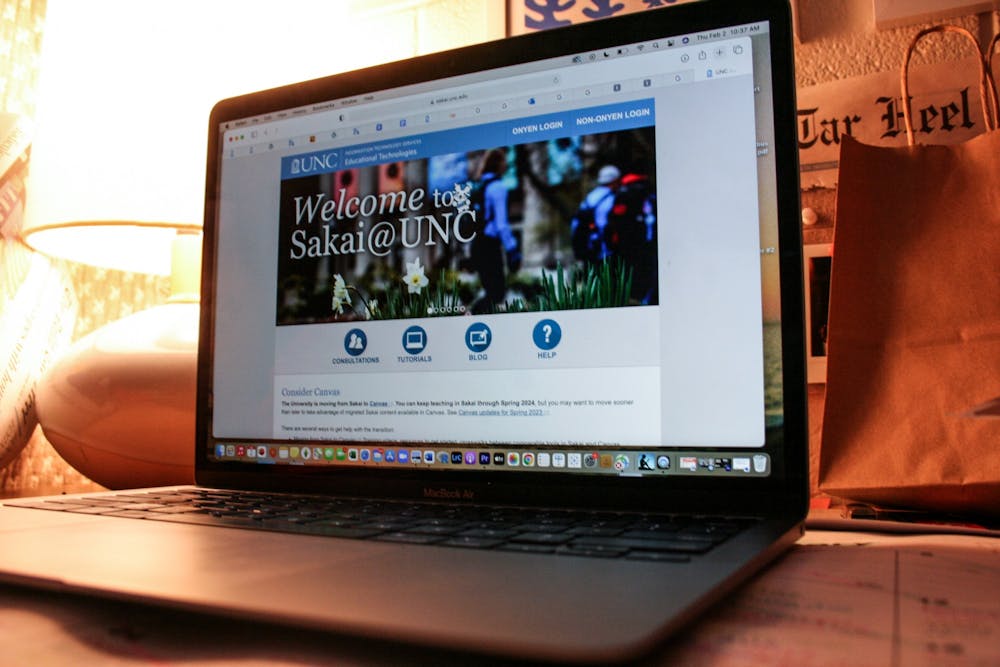
After all, it’s not as though the real world functions much differently. If you want to go to UNC, you can’t just walk on in. You apply through a tedious process and wait several months to hear back — all to the benefit of the school. This institution wouldn't view itself as prestigiously as it does if it just let anybody in. In that regard, if we want the internet to reflect the world around us, a little bit of gatekeeping can go a long way.


