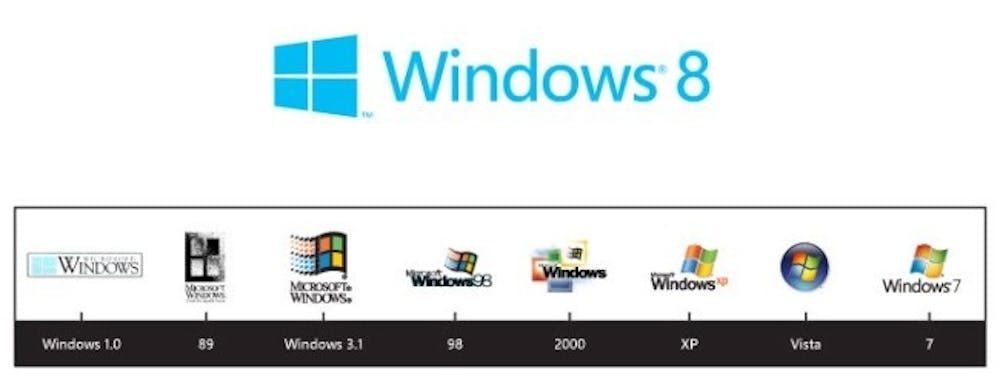
When Windows 8 comes out later this year, it will have a fresh, modern style based heavily on the Windows Phone 7 user interface. I covered the changes in my first post. But what we didn’t expect was that Microsoft would also update the Windows logo, which it hasn’t done since the Vista era.
I really like the logo. Not only is it a throwback to the Windows 1.0 logo, but it also looks a lot like the tiles featured in the Metro UI. Another cool element of the logo: it will move when you start up your computer and, depending on what your desktop looks like, will adapt to look like a part of your setup. In the image, the Windows 8 logo is blue, but if you had a textured lime green desktop, the logo would change to that style and color.
In the past two years, Microsfot has accomplished the difficult task of making its logos look much like its operating systems, and I’ve always liked it when the branding reflects the final product. The Windows 8 logo does a great job of emulating the look and feel of the operating system itself.
What’s your favorite logo? What’s your least favorite? Let us hear in the comments! You can follow Michael Leibel on Twitter @mleibel_dth.
To get the day's news and headlines in your inbox each morning, sign up for our email newsletters.
